Client
Ekayana Institute https://ekayana-institut.deDesign
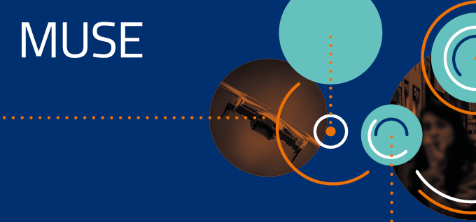
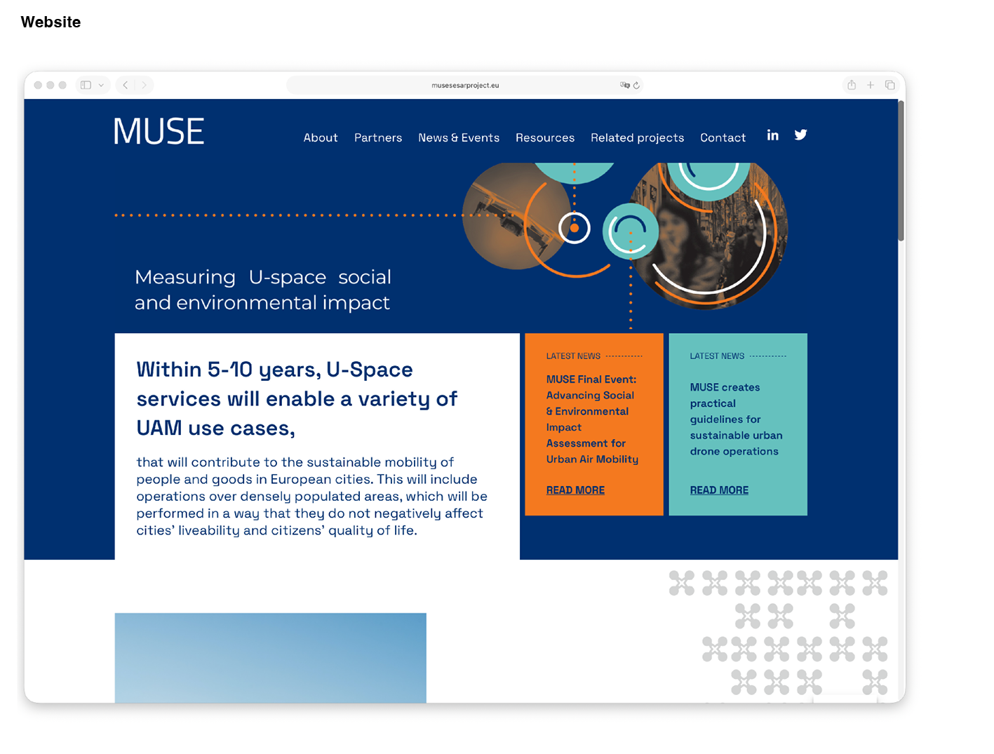
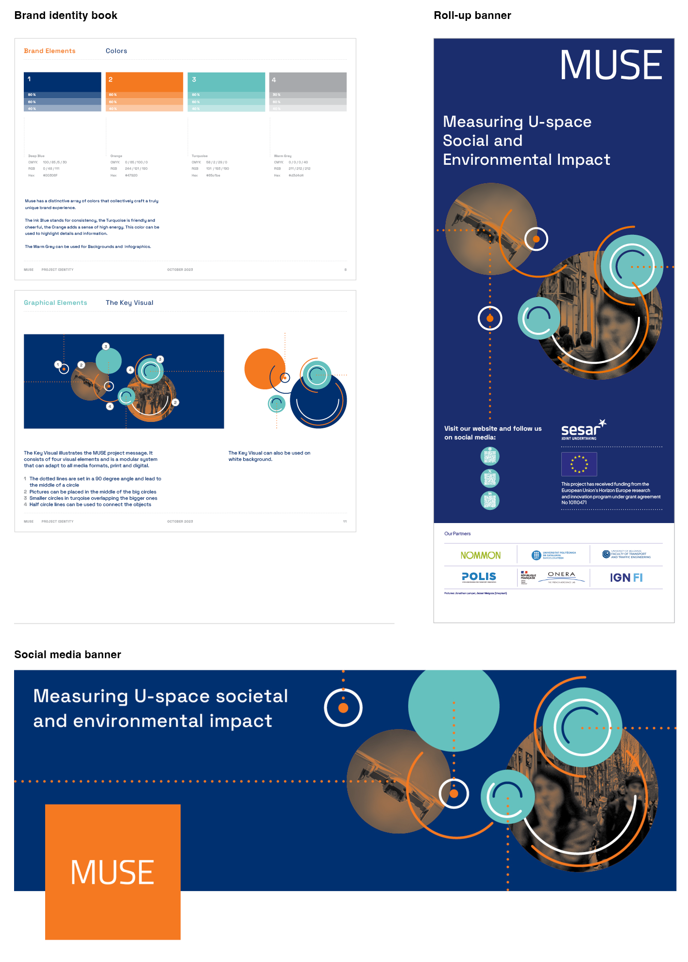
Corporate design and web design for the MUSE project.
The MUSE project, led by POLIS Network, creates ways to measure how urban air mobility – like drones and air taxis – affects the quality of life in cities. It especially looks at noise and visual pollution caused by drones.
The corporate design, including the key visual, brand guidelines, and communication media, was created by Daniel Schnatterer, and the website was developed by our partner Weichie.com.
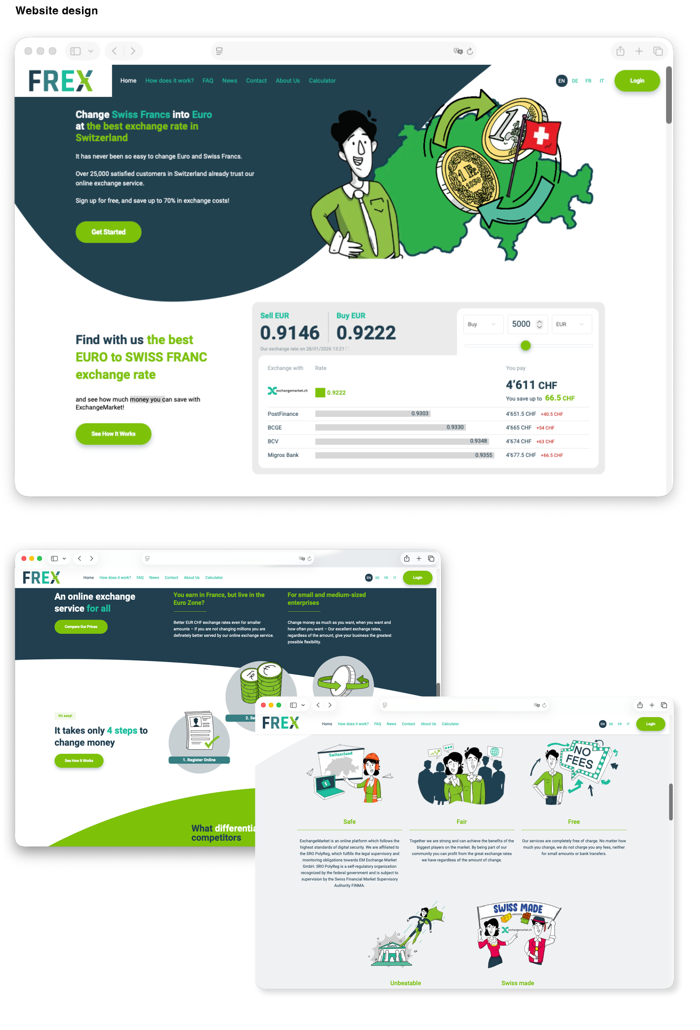
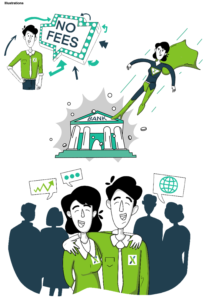
For FREX, a Swiss currency exchange platform, we created a complete corporate design and website. To give the brand a personal character, we developed humorous illustrations and animations.
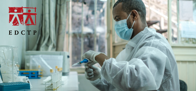
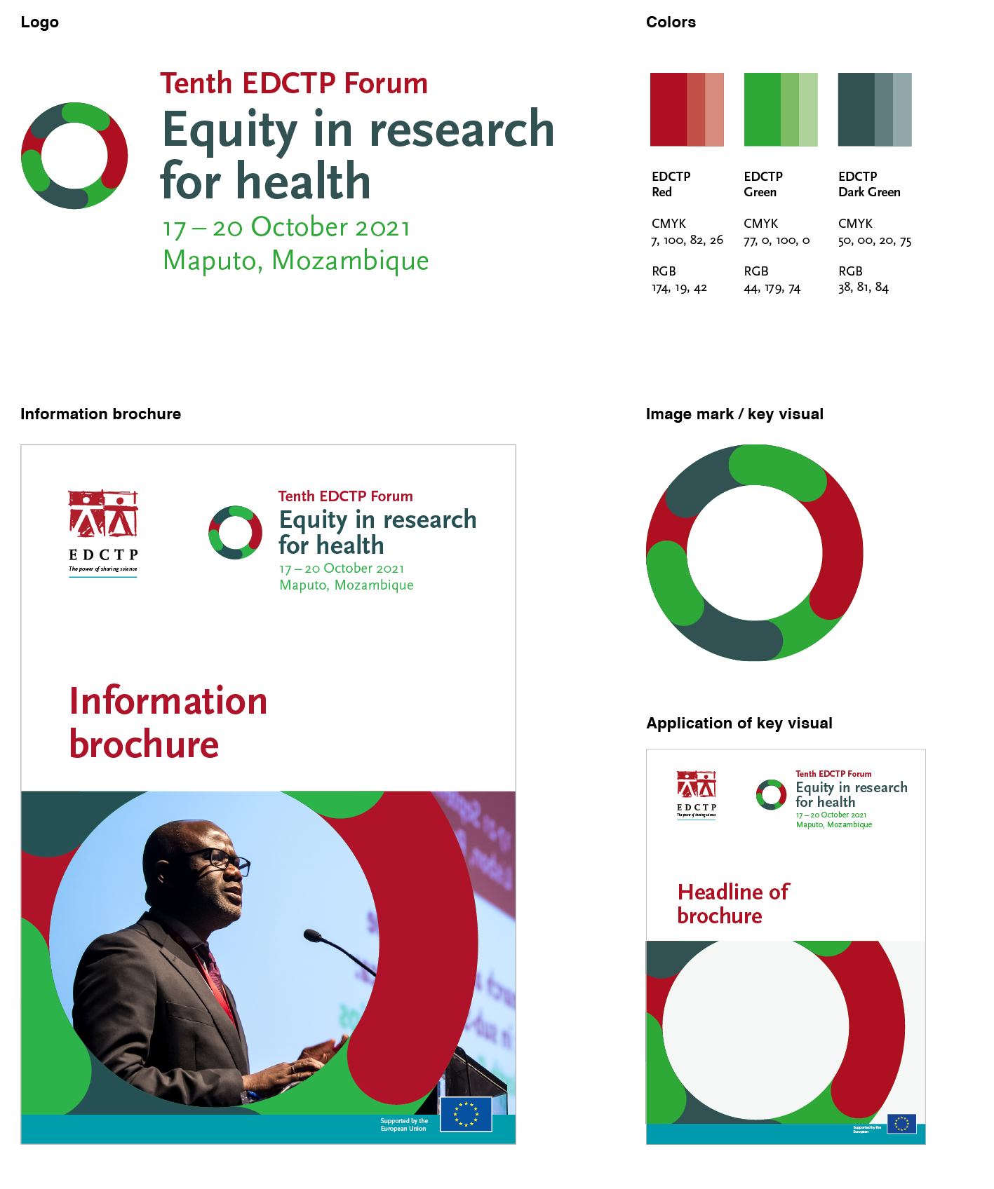
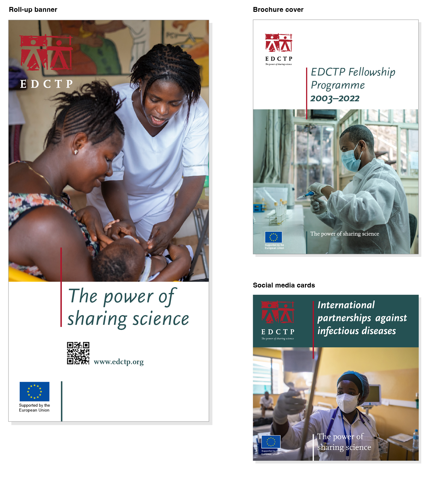
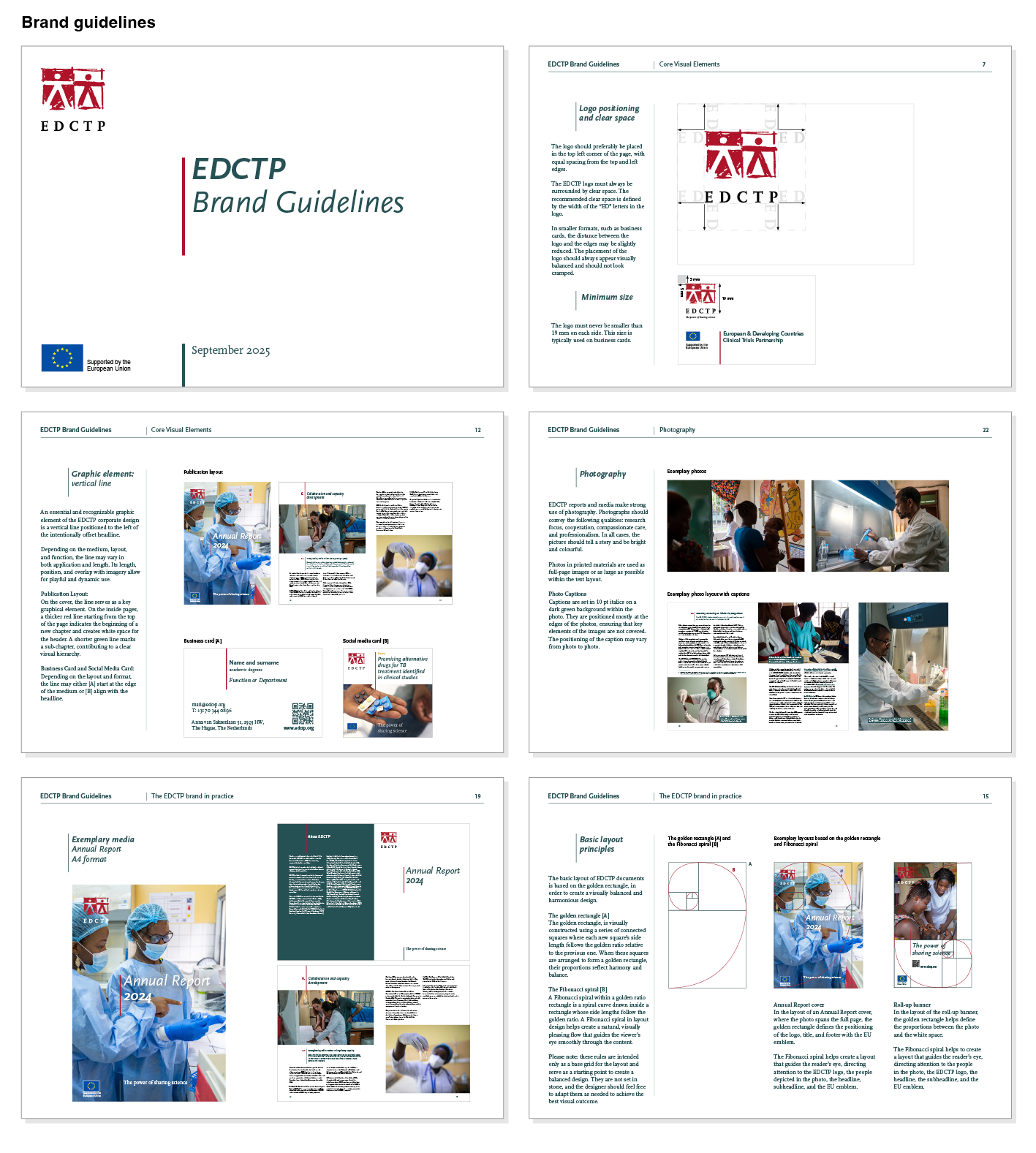
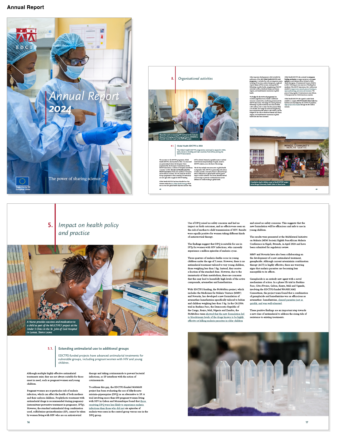
For EDCTP, we have revamped their corporate design.
An important means of EDCTP’s communication is the use of photos that tell the stories of projects funded by EDCTP. That is why we developed a corporate design that places photos prominently in the foreground.
The design uses large amounts of white space and big photos to create an open, visually appealing layout. The two contrasting typefaces, the Scala Serif and Sans, ensure a clean, bold, and modern appearance with a warm, human feel.
An essential graphic element of the corporate design is a vertical line positioned to the left of the intentionally offset headline, giving EDCTP a recognizable identity.
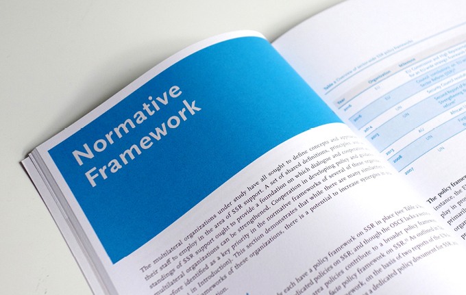
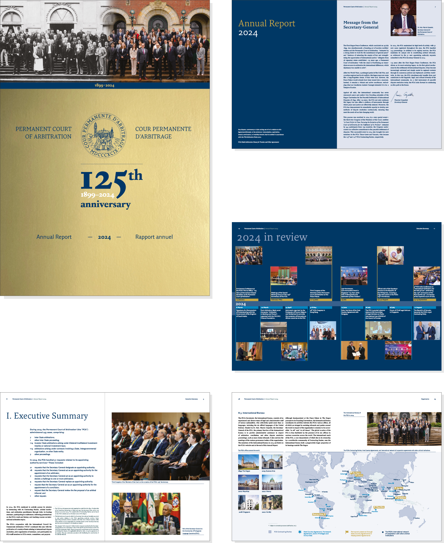
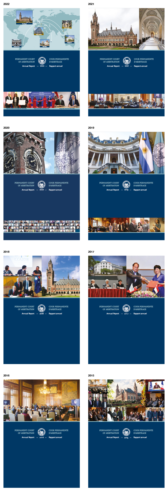
We conceptualized and designed the Annual Report 2024 for the Permanent Court of Arbitration. To mark the PCA’s 125th anniversary, the cover was printed with golden metallic ink, giving the publication a distinctive and celebratory touch.
The report is 140 pages long, written in English and French, and includes various maps and charts.
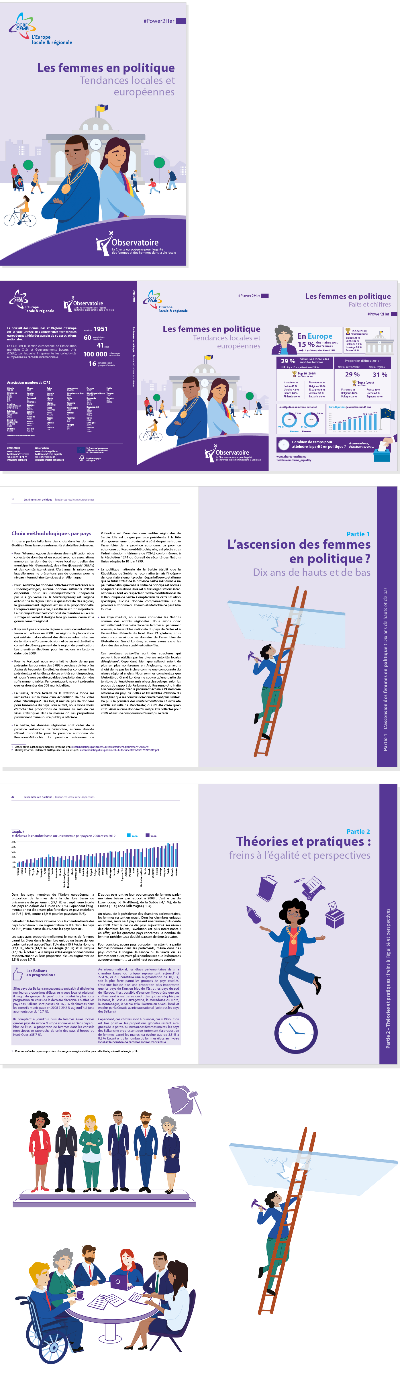
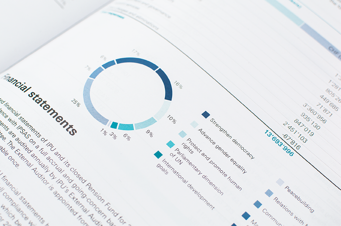
We have designed a report that evaluates the progress of women’s political representation in Europe over the past decade. Additionally, Floor van der Doelen and Martijn Rook designed illustrations that provide humorous and metaphorical commentary, giving the report a strong and personal visual identity.
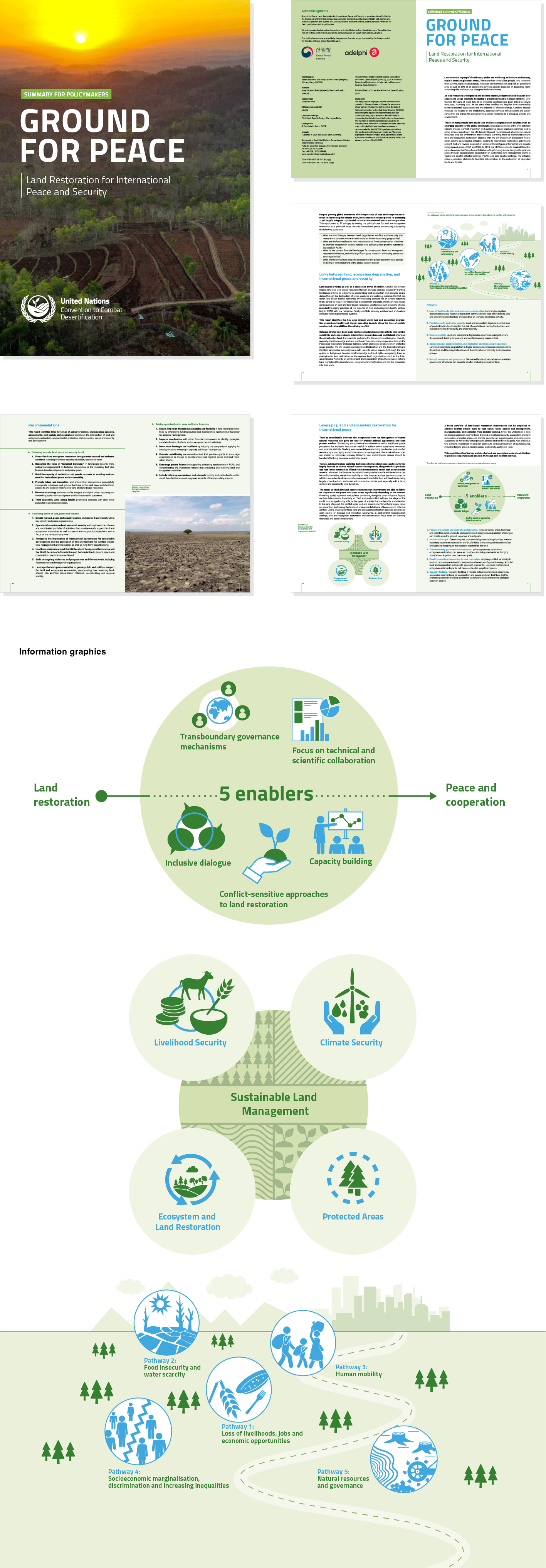
We designed a 72-page report and a summary brochure for adelphi and the UNCCD.
The report examines the connection between land, peace, and security within the UNCCD Peace Forest Initiative, highlighting the role of land and ecosystem restoration in promoting global peace.
The work on the report and brochure included the creation and design of a new layout and various information graphics, all aligned with the UNCCD brand guidelines. The report was presented at UNCCD COP 16 in Riyadh, Saudi Arabia.
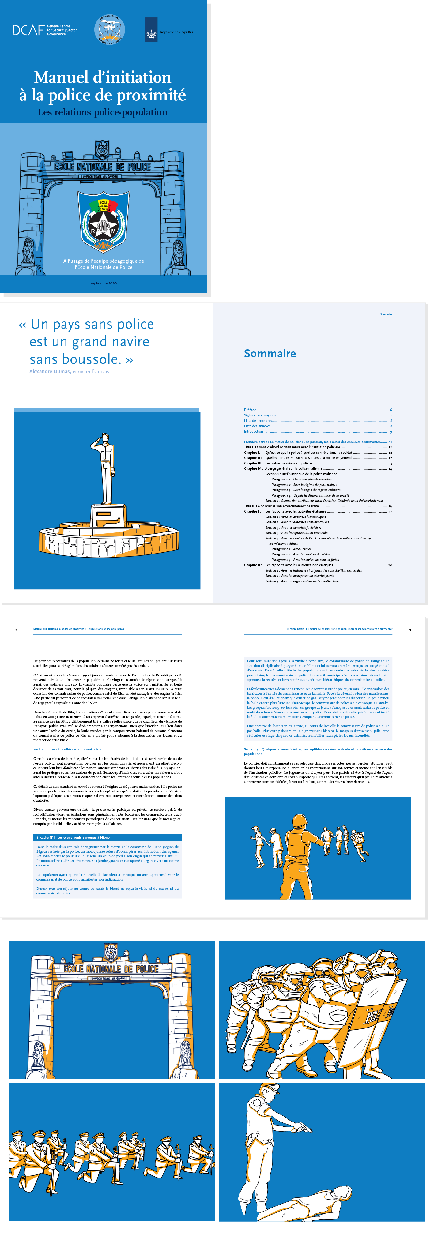
We have been asked to design a training manual for the National Police Academy in Mali. This manual is a practical resource aimed at improving police training in knowledge, skills, behavior, and critical thinking. We have created detailed illustrations that accurately depict real-life scenarios.
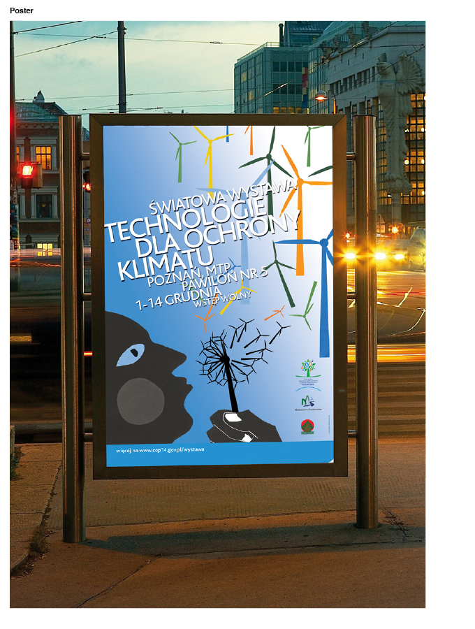
We were commissioned to create a key visual for an exhibition on technology at the United Nations Climate Change Conference (COP 14) in Poland.
For this, we created a poetic illustration depicting a person blowing a dandelion, with its seeds transforming into wind farms.
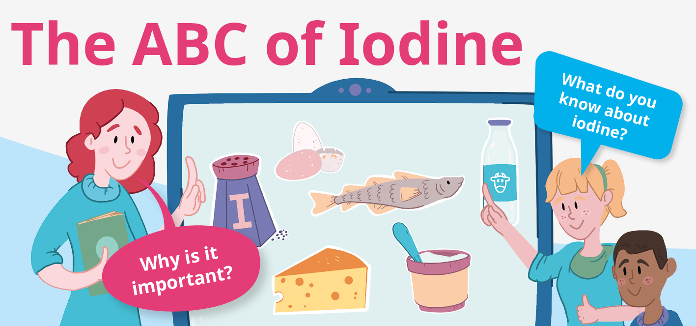
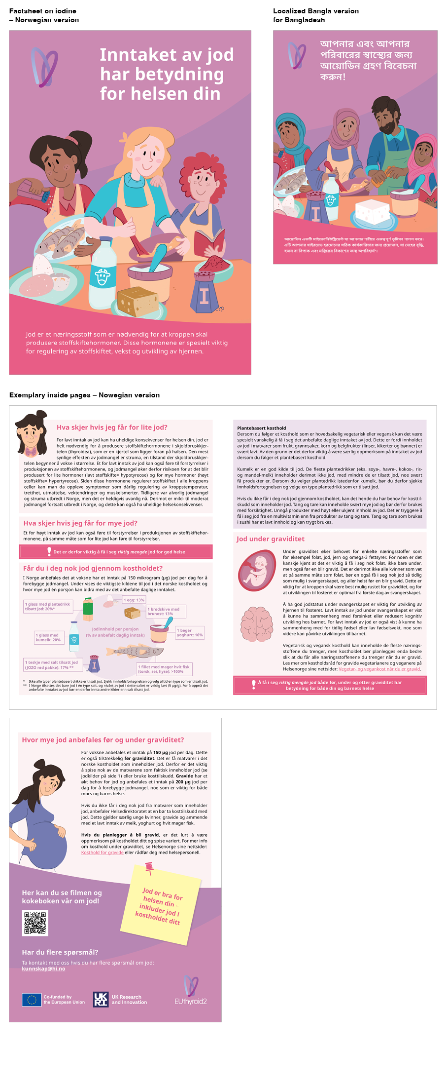
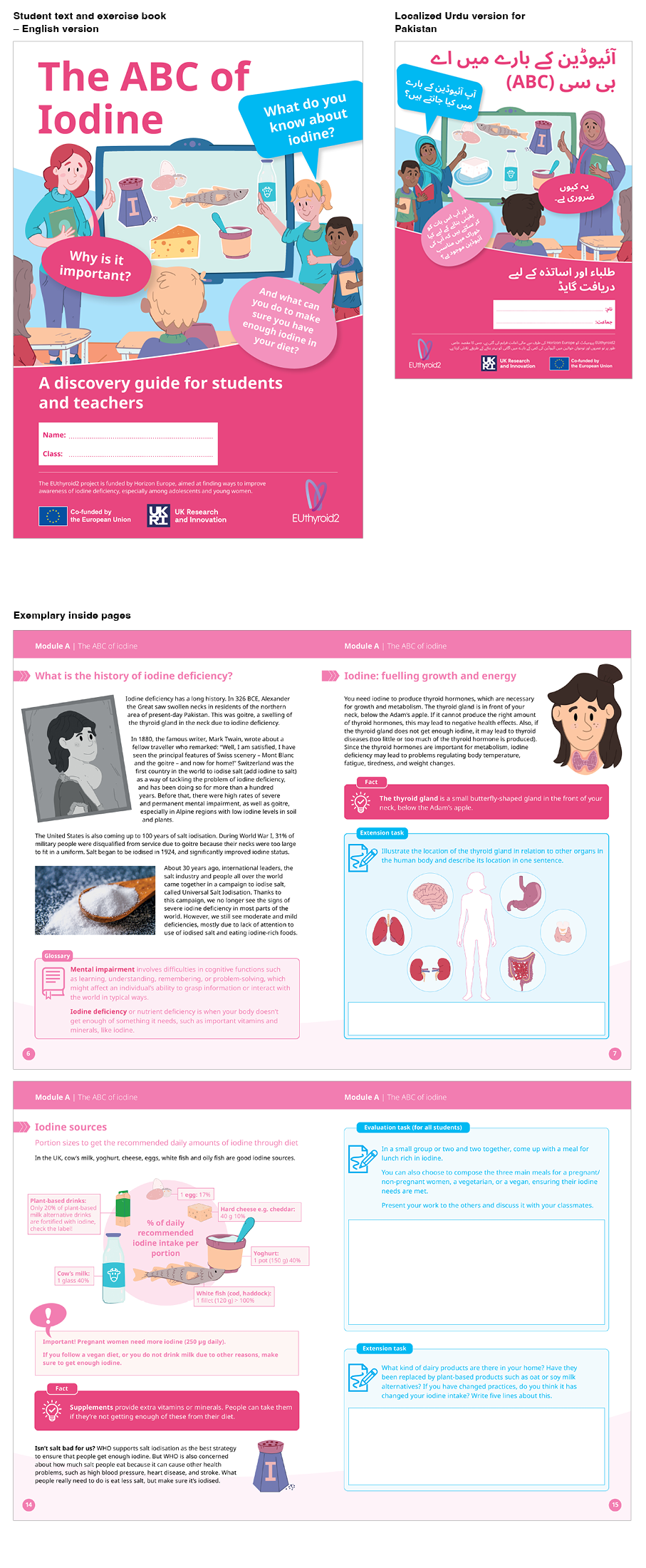
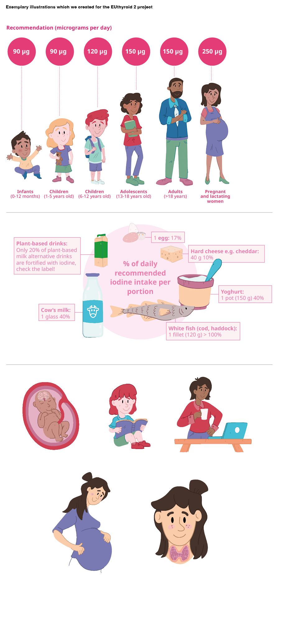
EUthyroid2 is an EU-funded project aimed at eliminating iodine deficiency in Europe and beyond.
For the Thyroid International Federation, which is the project coordinator, we have developed the complete visual identity and all communication media for the project.
The project is being implemented in three different settings for three different target groups: young scholars, adolescent women, and the healthcare environment.
For young scholars, we designed a textbook and exercise book on the topic of iodine. Our colleague, Martijn Rook, created illustrations that give a personal identity to the project, spark interest, and guide the scholars through the topic. For adolescent women, we created various fact sheets, and for the healthcare environment, we developed various content forms and guidelines.
As the project is conducted in Europe and beyond, we also created localized versions of all communication media, including Greek, Polish, Norwegian, Urdu, and Bangla. For each language version, we created unique illustrations that adapt to the culture.
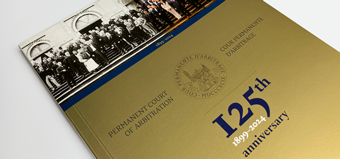
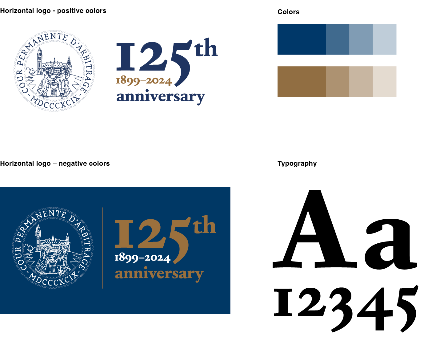
The Permanent Court of Arbitration has requested our assistance in crafting a commemorative logo for their upcoming 125th anniversary.
We have developed a logo using a serif typeface (Corundum by Adobe Fonts), intentionally chosen to evoke tradition and underscore the PCA’s deep historical connections. However, to infuse a contemporary flair, we integrated large, bold numerals into the design.
The typeface employs old-style numerals, wherein certain numbers like ‘5’ extend below the baseline, imparting a bold and distinguished appearance, fitting for this occasion.
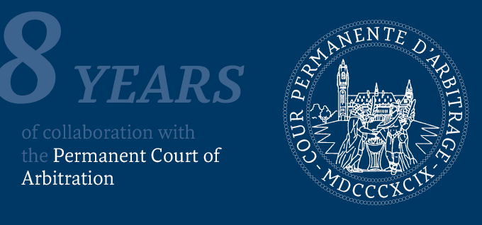
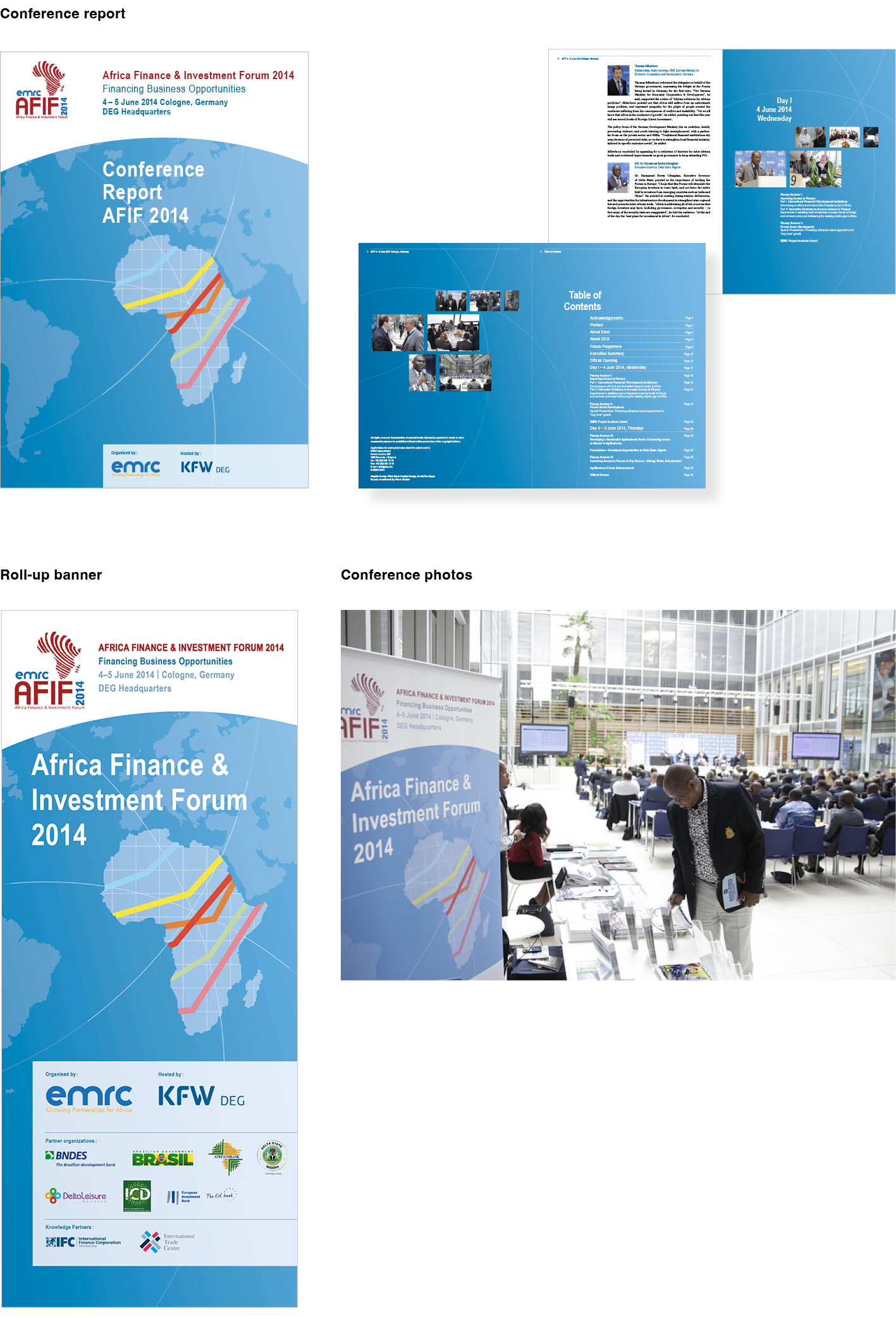
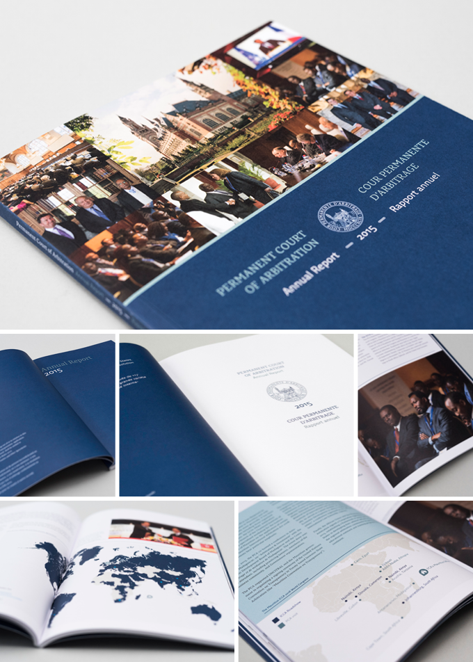
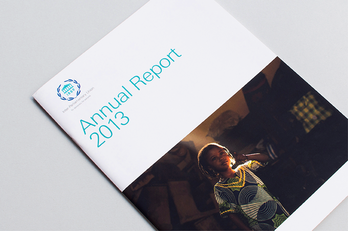
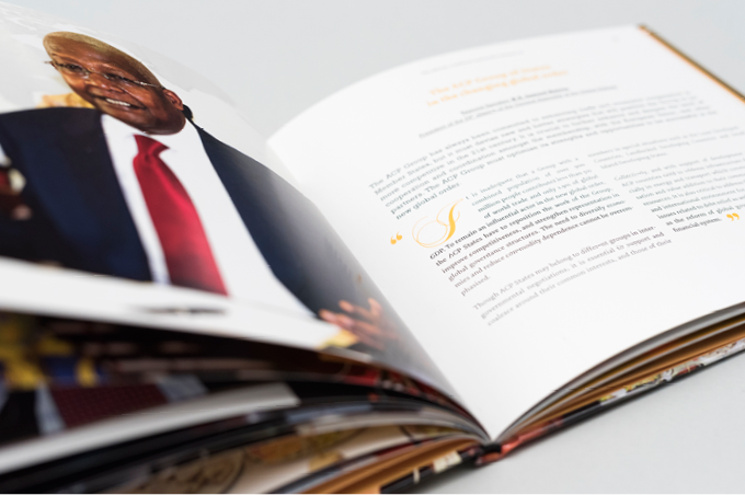
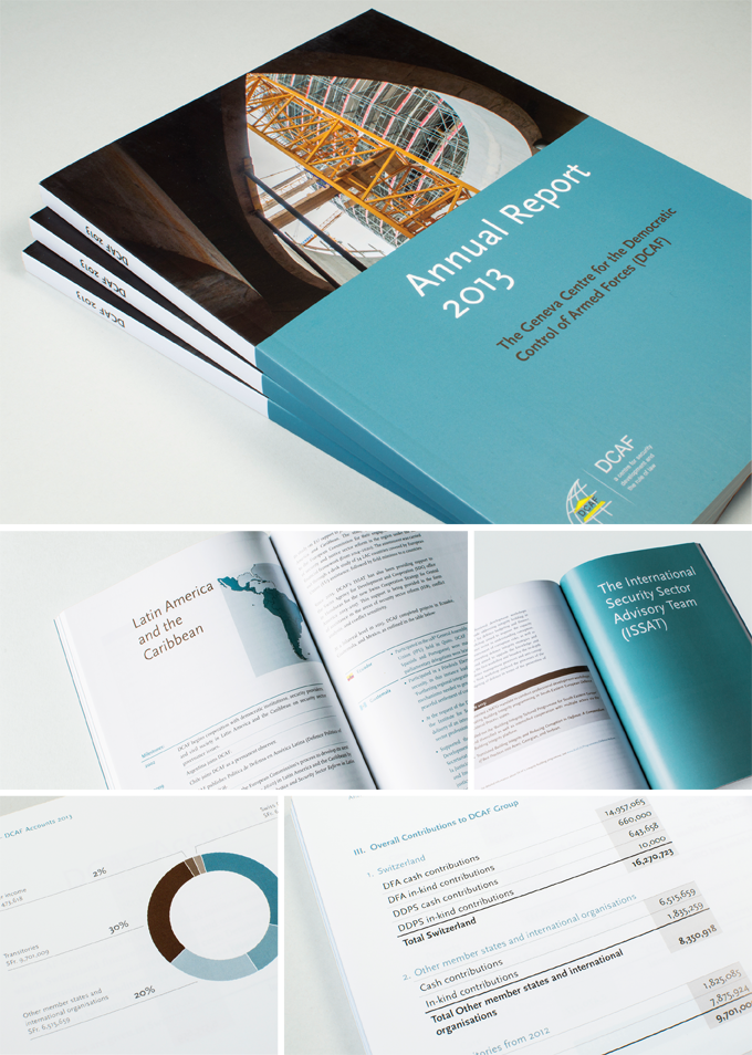
For the past 8 years, we have been collaborating with the Permanent Court of Arbitration (PCA). Each year, we create an Annual Report and brochures in English, Spanish, and French. The annual reports consist of approximately 100 pages and include both English and French sections.
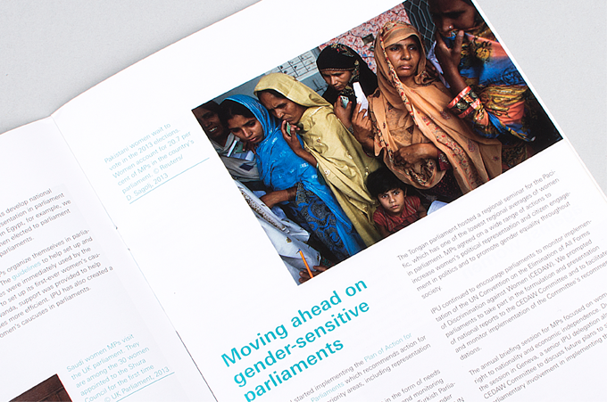
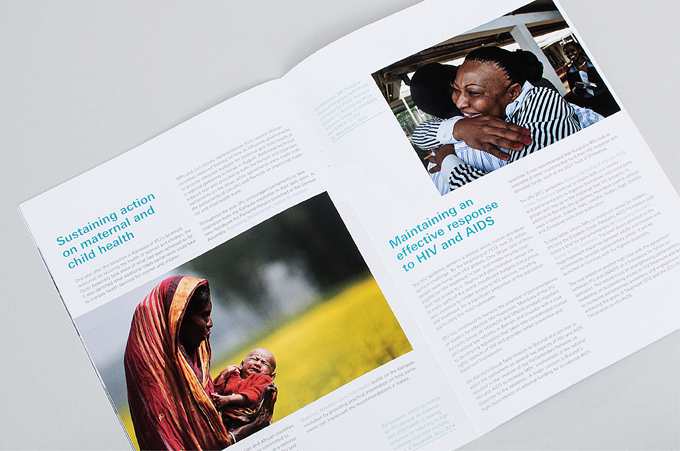
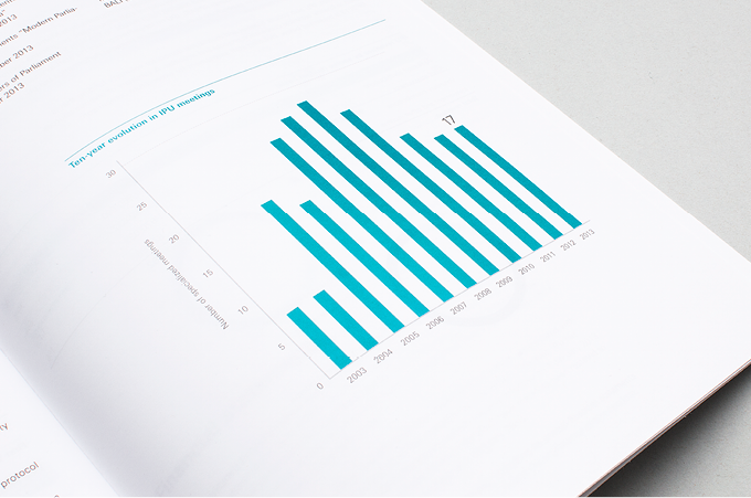
Our work involves text layout, photo layout, the design of information graphics and maps, preparation for both print and online use, and print supervision.
We print the reports at Zwart op Wit, a family-owned printing company based in Belgium. Zwart op Wit exclusively uses environmentally friendly papers and ink, making it one of the few CO2-neutral printing houses.
The Annual Report is printed on high-quality offset paper and is thread-bound.
Each year, we eagerly anticipate holding the printed report in our hands.
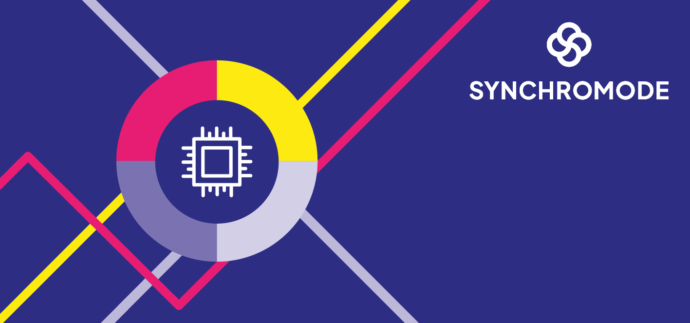
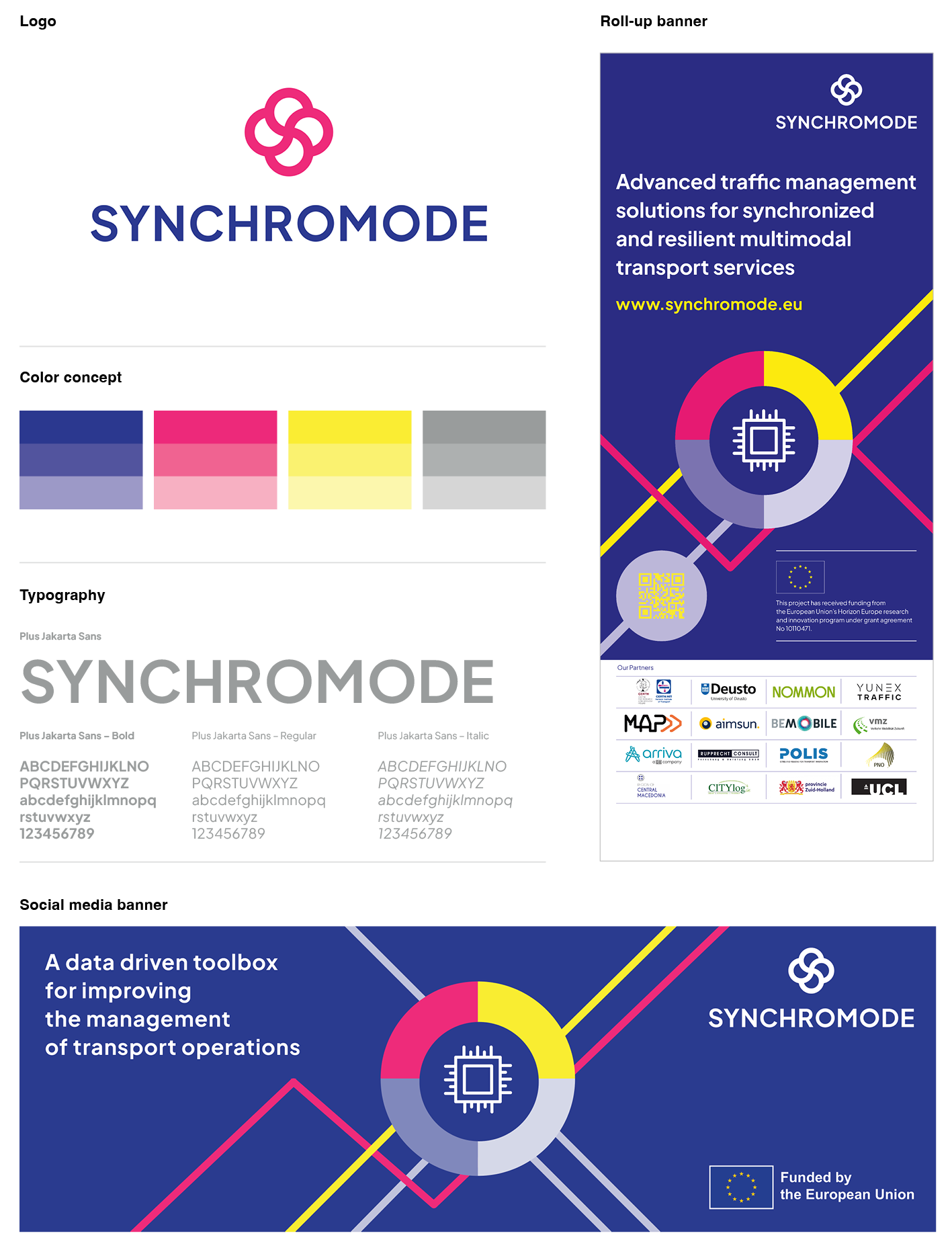
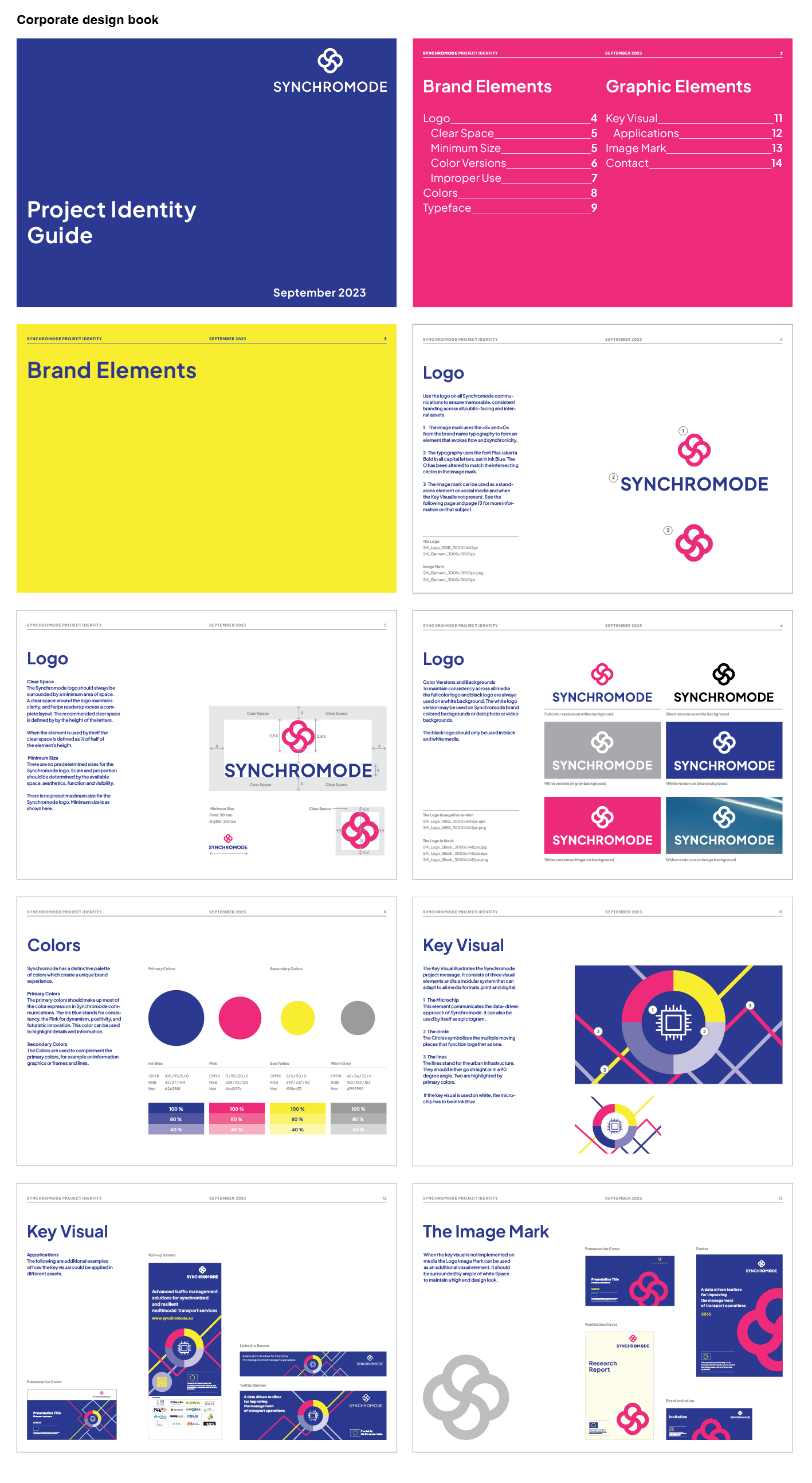
We have developed a corporate design for SYNCHROMODE, an EU-funded project with the goal of creating a data-driven ICT toolbox to enhance transport operations management.
Our work for SYNCHROMODE encompassed the entire corporate design package, which included the logo, key visual, communication materials, and a corporate design guide.
This impressive design was created by our colleague Daniel Schnatterer.
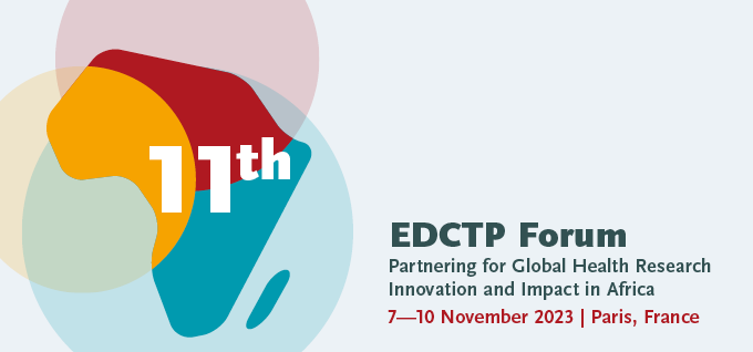
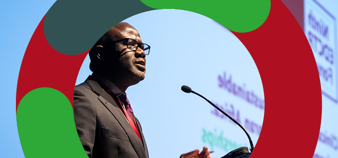
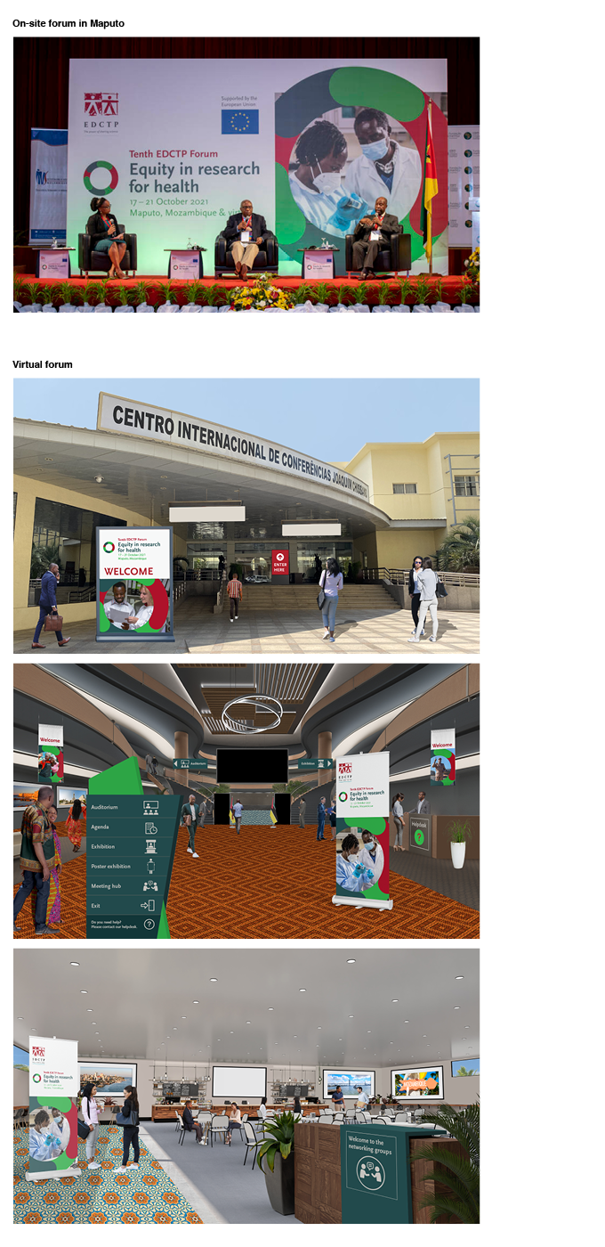
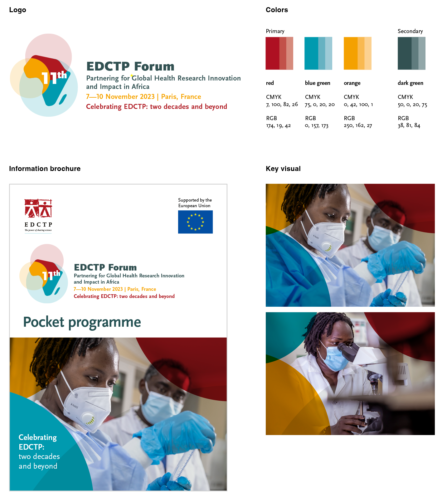
Concept and design of the Eleventh EDCTP Forum in Paris. For the Forum we created the complete visual identity including key-visual, logo and various communication media.
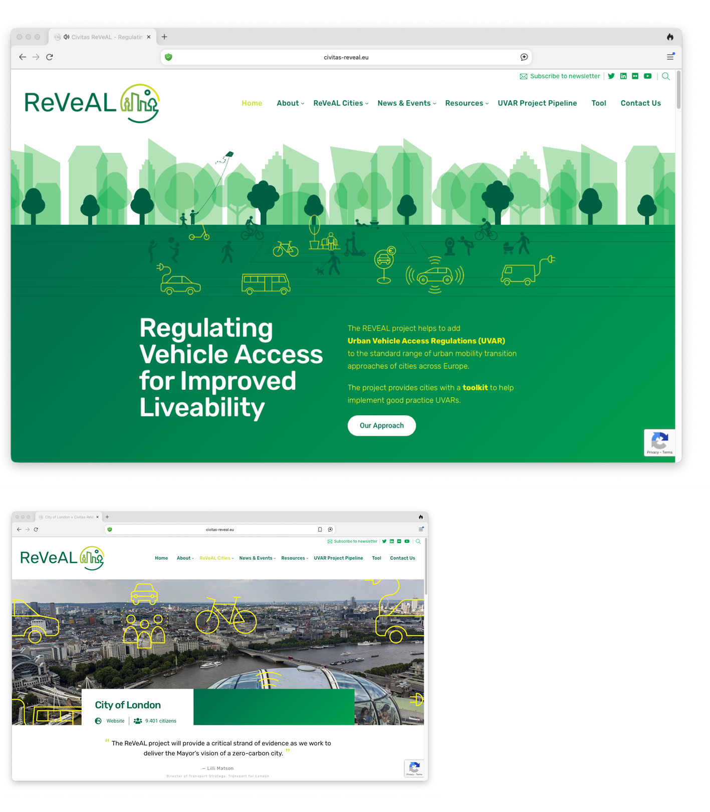
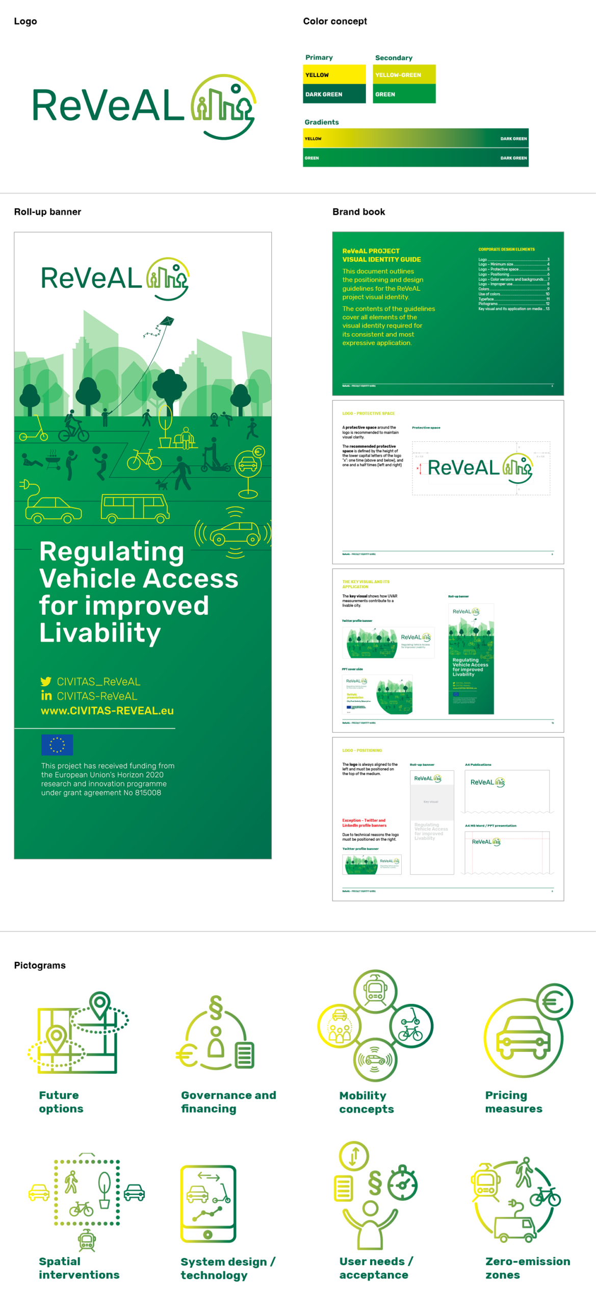
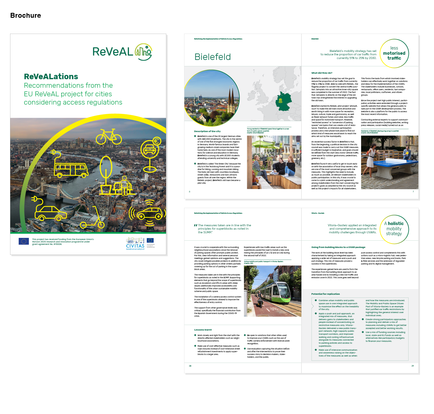
For the EU project ReVeAL – Regulating Vehicle Access for Improved Liveability – we created the complete corporate design.
The challenge was to create a design that effectively communicates the benefits of sustainable urban policies – such as reduced emissions, less noise, and improved accessibility – to enhance the quality of life for city residents.
Corporate design includes logo, visual guidelines, typography, colors, pictograms, Powerpoint presentations, banners, leaflets and a WordPress website.

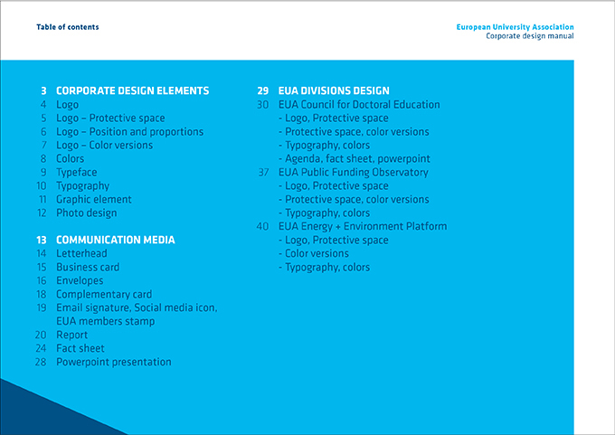
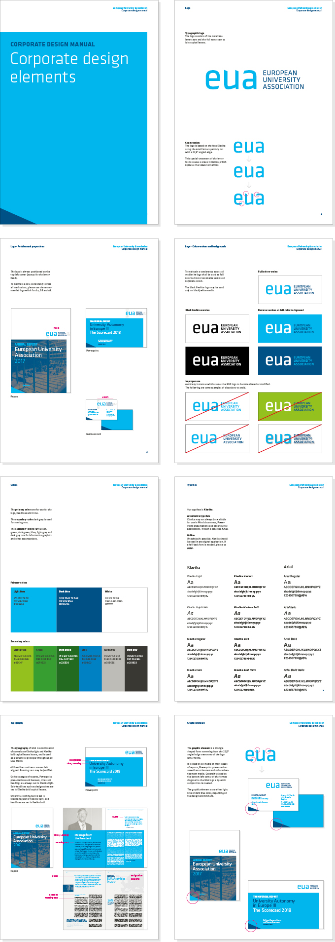
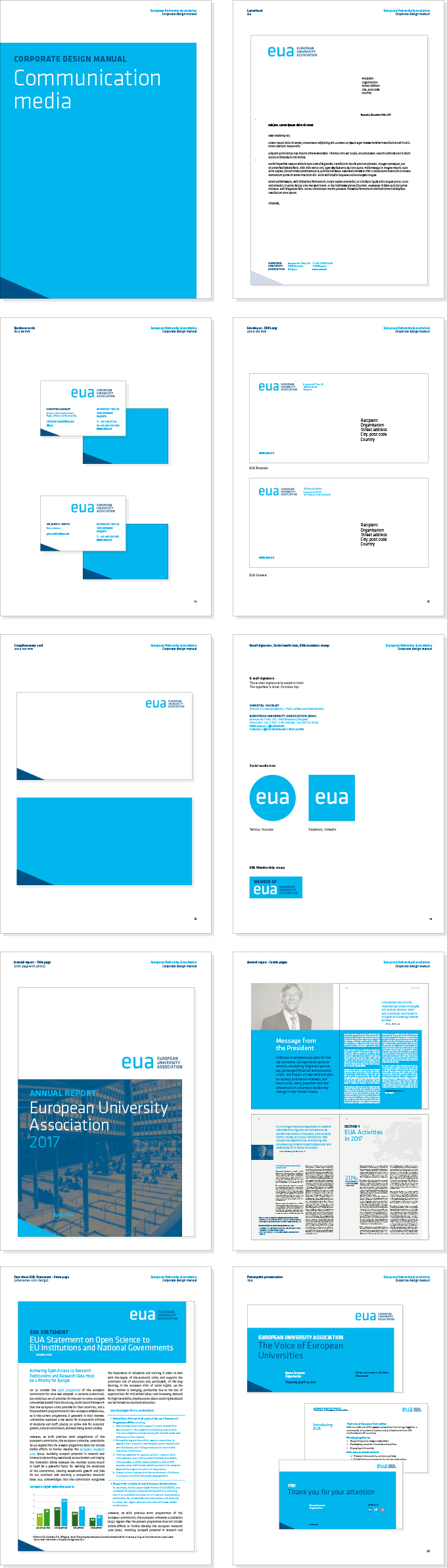
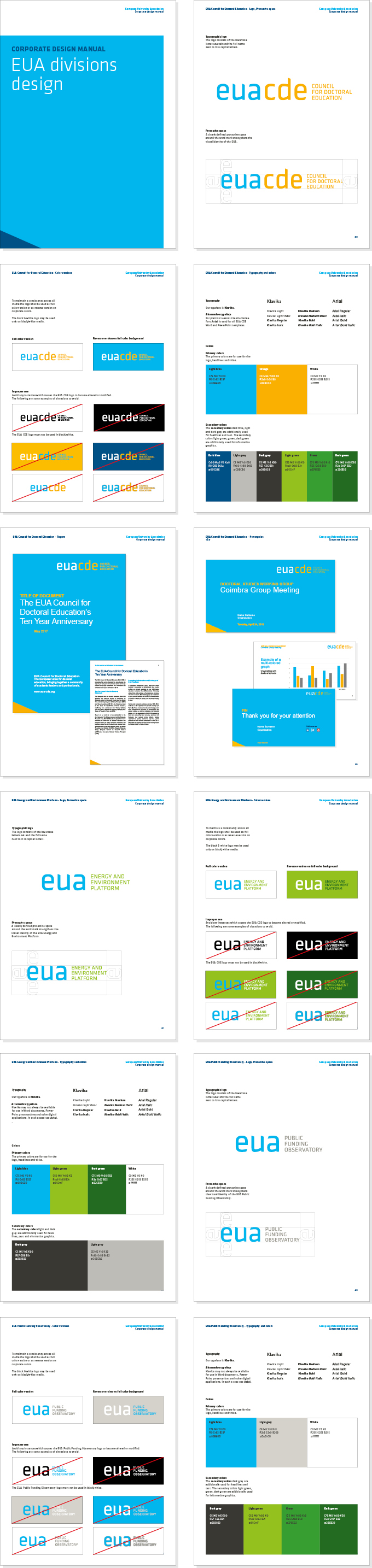
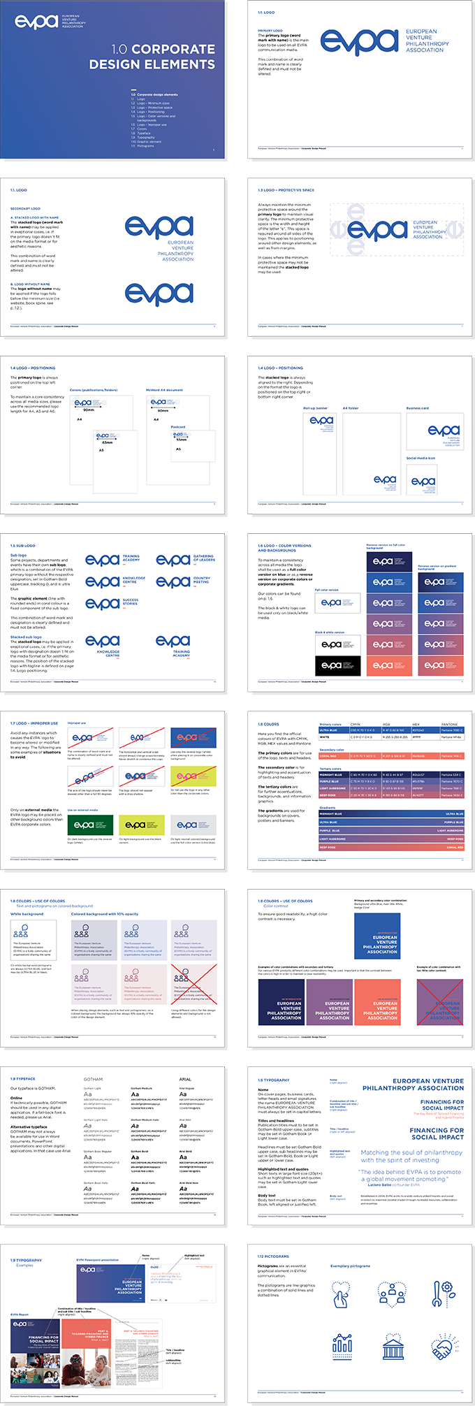
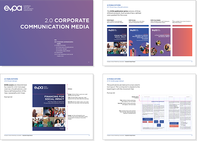
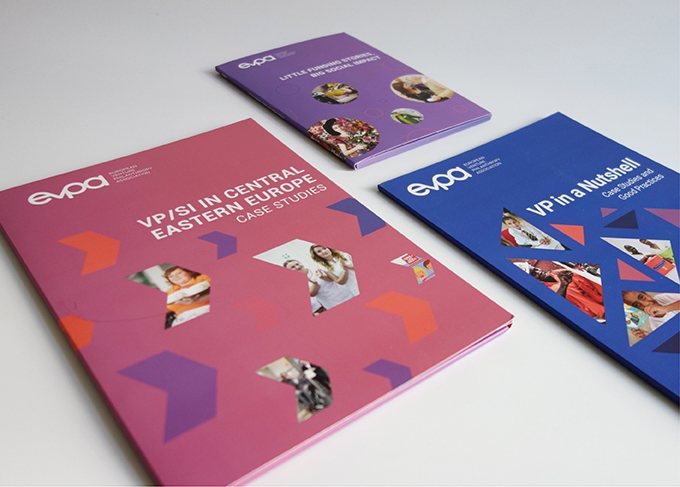
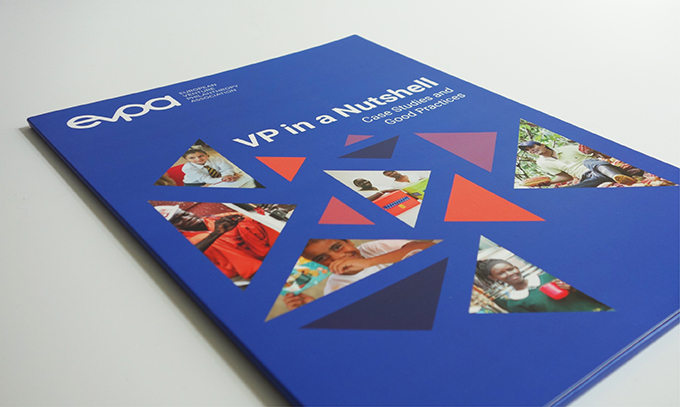
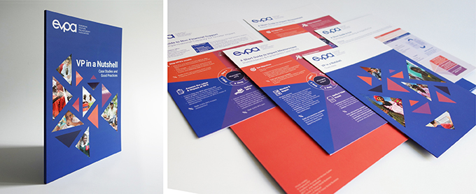
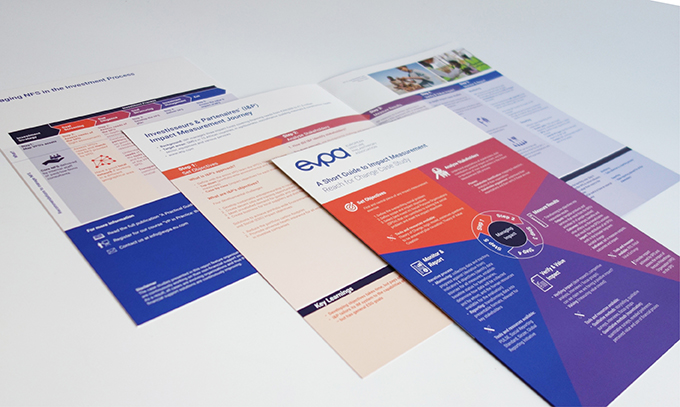
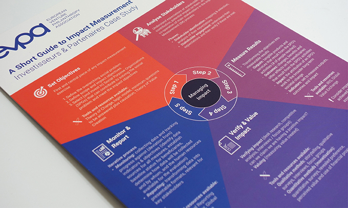
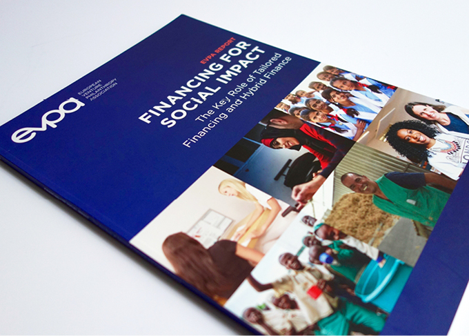
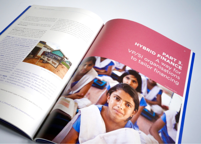
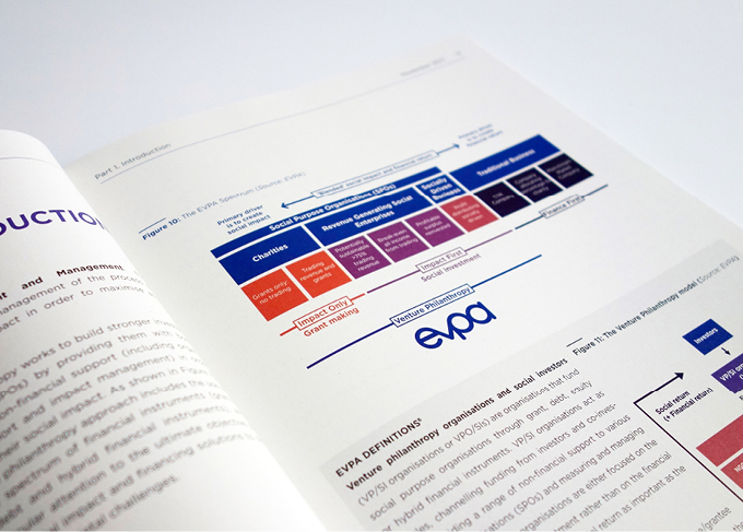
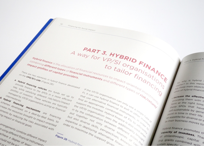
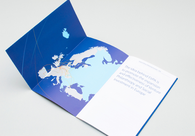
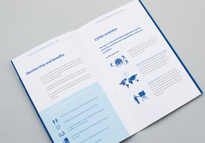
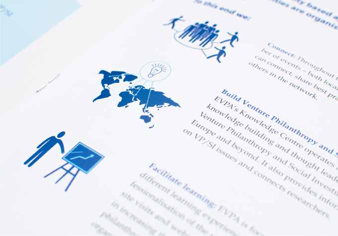
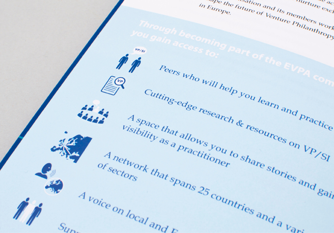
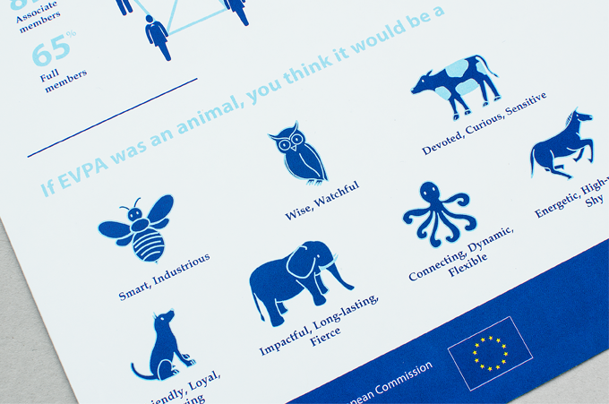
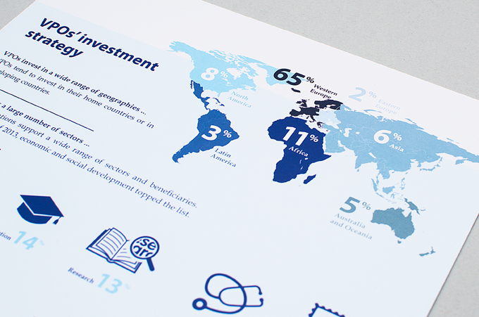
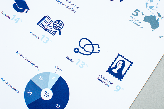
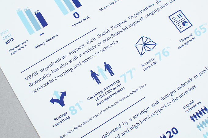
Corporate design manual for EVPA, European Venture Philanthropy Association, including all corporate design elements and communication media.
* Basic corporate design and logo design by Ping Pong design studio, Gent
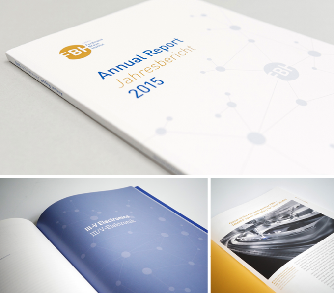
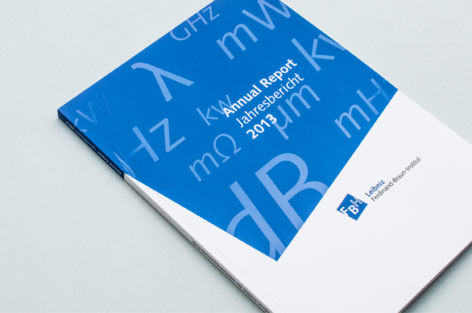
Design and layout of the annual report 2015 for the Ferdinand Braun Institute, Forschungsverbund.e.V., Berlin. http://www.fbh-berlin.de/publikationen-patente/jahresberichte
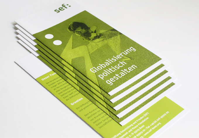
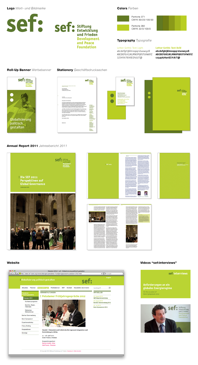
For the SEF Development and Peace Foundation we created a wholistic Corporate Design including stationary and all communication media such as corporate flyer, Global Governance Spotlight Magazine, Foreign Voices Magazine, annual report, digital newsletter and an extensive website.